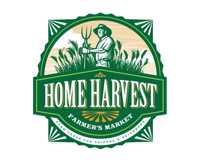
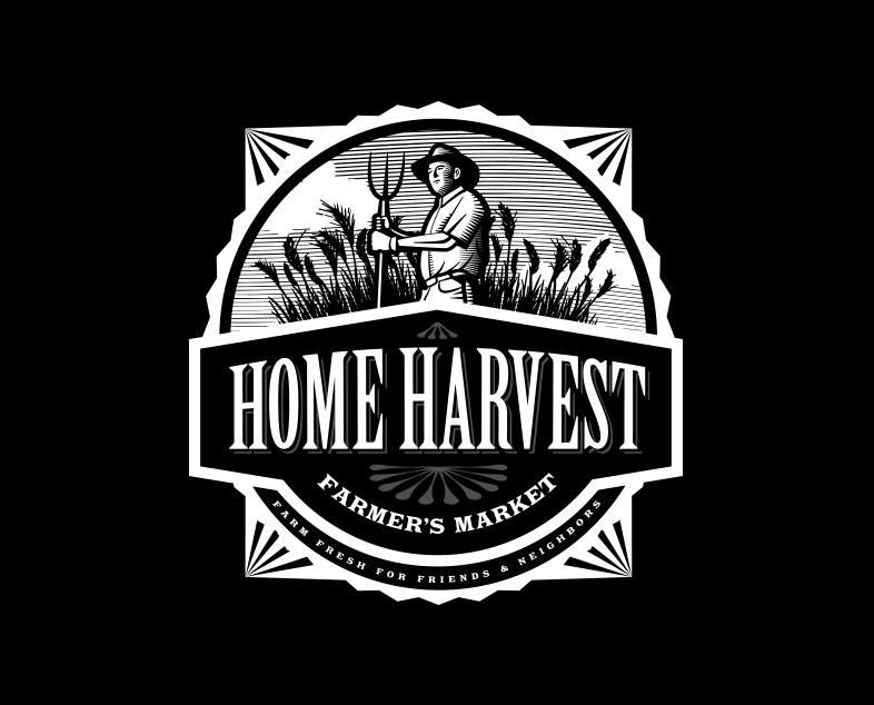
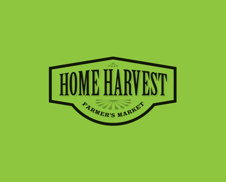
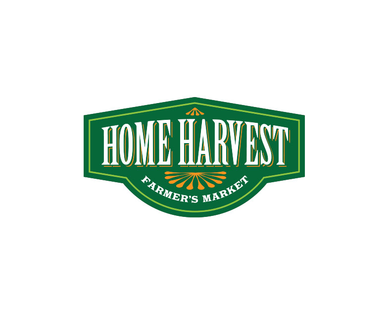
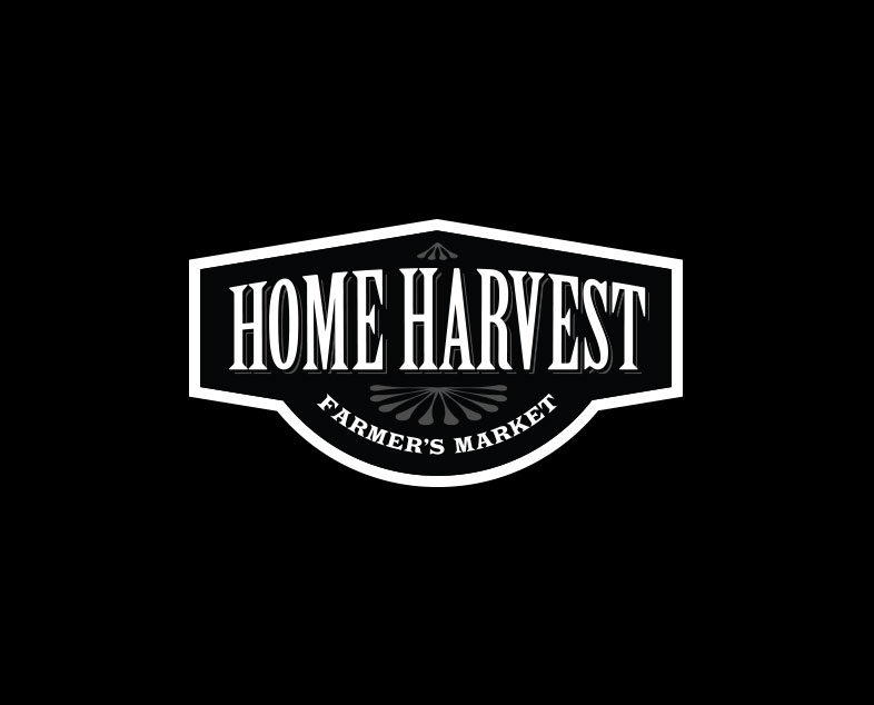
CLIENT:
Home Harvest Farmer’s Market
DESCRIPTION:
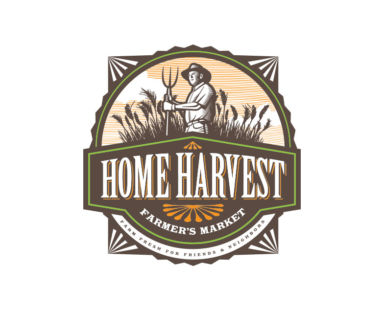
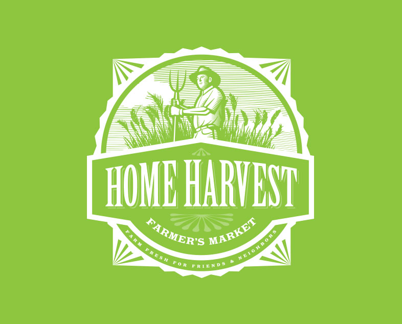
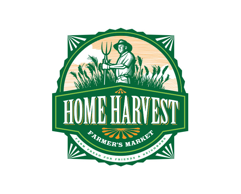
Home Harvest Farmer’s Market wanted a look and feel for their new brand that would feel organic and home grown. Research was done and decided upon an early 19th century illustrated woodcut feel. For applications in which the logo needs a more simple solution, a secondary logo was provided.